Many poems enact wild rides of the imagination, but John Ashbery’s “Self-Portrait in a Convex Mirror,” which announced a new kind of craft in 1974, is also vivid in concreteness and its emphasis on form. Referencing a Mannerist painting by Parmigianino, Ashbery carefully elaborates size, angle, light, texture, and time (a “peculiar slant / Of memory”) to tease out his poem’s intellectual shape—an approach that draws particular attention to the piece’s own materiality. For a publisher of sensitivity, the work raises a particular question: how to publish a poem that brings the physicality of seeing, reading, and writing so distinctly to the fore?
That was one challenge that Andrew Hoyem, one of the leading letterpress printers in the country, faced 29 years ago when he undertook a new edition of the poem. Hoyem runs Arion Press, a fine-edition publisher in San Francisco. Some of the books it has produced are set by hand, and all are printed in small editions whose volumes sell for hundreds or even thousands of dollars. Following tradition, Hoyem either melts down the type or returns it to its cases after the run is complete, preserving the volumes’ uniqueness. The approach runs contrary to mainstream trends in today’s literary marketplace, and, like the Ashbery poem, it rests on the value of precision: the physicality of the book as an object and the startling originality of the craftsman’s eye. “There’s a kind of human rhythm to this,” Hoyem explains. “That’s what fine printing is—it’s about being perfect.”
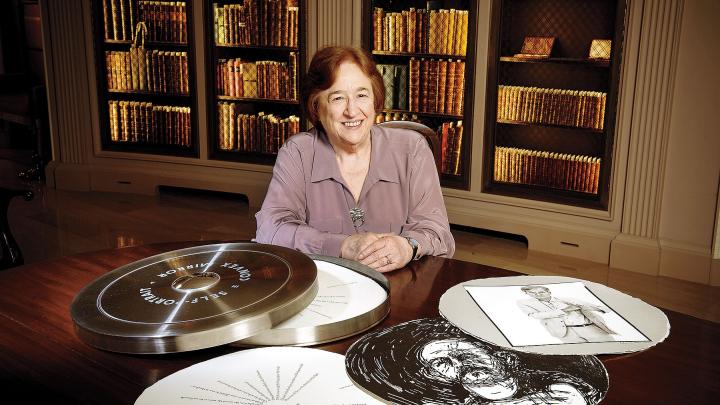
In pursuit of that perfection, he chose not to make “Self-Portrait in a Convex Mirror” a traditional book at all. Instead, he imagined the printed pages as a physical object shaped by the poem’s imagery and cultural vernacular. He decided the pages would be round, rather than rectangular, with an extra-large 18-inch diameter. He printed the lines of the poem like spokes, radiating outward from the center of the page, with generous space between. He stacked the round pages in a custom-made, film-reel-like canister for each copy, in lieu of binding, and, on each canister’s exterior, fitted a convex mirror in which the viewer would see him- or herself. (“I see in this only the chaos / Of your round mirror which organizes everything.”) He commissioned eight artists, including Jim Dine and Willem de Kooning, to respond to the Parmigianino painting, and interpolated these new works among the wheels of text. Ashbery [’49, Litt.D. ’01] contributed a recording he’d made of the poem, and Hoyem included the LP, with the Parmigianino on its cover. All that remained was a critical introduction. For that, he sought the counsel of his wife, Diana Ketcham, a former academic and a critic who is the press’s senior editor.
Ketcham proposed Helen Vendler—at that point a New Yorker contributor and a relatively new face on the Harvard faculty. (She is now Porter University Professor.) The proposal, Hoyem and Ketcham recall, struck them as a long shot, but one worth trying. (“Early on, I had some advice from a much older man,” Hoyem explains. “He told me, ‘Go to the top—ask.’ ”) To his surprise, Vendler agreed. She wrote an introduction, which Hoyem printed as “liner notes” to Ashbery’s LP. “What drew Ashbery to this painting was its combination of extreme beauty and self-conscious expressive distortion,” Vendler explained in her essay. “A convex or concave mirror distorts what it represents; the principle can be taken to extremes (as with mirrors in a funhouse) or it can be used to convey the distancing effect of aesthetic self-representation.” She quoted aptly from Wallace Stevens, Gerard Manley Hopkins, and George Herbert. Hoyem and Ketcham loved the essay. Vendler was much taken with the printed result, too.
“I didn’t know, when I was asked to do it, that I would be given a copy—that stunned me,” she explained recently. “This gorgeous object! So, from then on, I was willing to do anything that seemed within my powers with Andrew.”
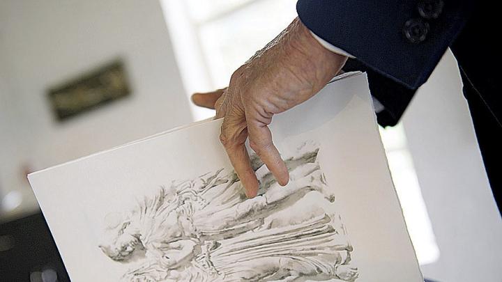
They’ve done a good deal. In the years since the “Self-Portrait” edition appeared, in 1984, Vendler has become Arion Press’s most prolific contributor, and the two have together produced 11 volumes, accompanied by original work from artists such as Jasper Johns, Richard Diebenkorn, and Sol LeWitt. Most recently, they collaborated on Stone from Delphi, a collection of classical-themed poems by Seamus Heaney. Vendler helped select and introduce the poems, with an eye to their historical overtones; her introduction explains how “Heaney’s lyric poems drawing on the classics address motifs significant to his own sensibility, ethics, and linguistic hunger, [and reclaim], for modern ears, works inaccessible in their original language to the common reader.” The book is bound with a goatskin spine and printed on mold-made paper from Germany, with 16 watercolor illustrations of Greek and Roman statues by the American painter Wendy Artin, done exactly at scale and reprinted on a high-grade Epson digital inkjet printer—a technology that Hoyem, a master of the old ways, not a vassal to them, calls “one of the major innovations in the history of printing.” There are only 300 copies on the market, and they are costly: $1,200 each.
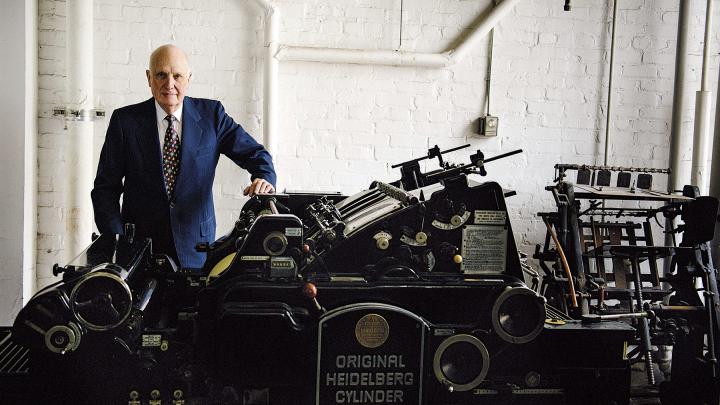
Arion Press is now the only full-service letterpress left in the United States. Although facets of traditional bookmaking linger—some letterpress printing here, some hand-binding there—no other workshop houses the complete process, from the casting of type to the trimming of covers. In 2000, Hoyem and Ketcham launched a nonprofit, the Grabhorn Institute (named for two earlier San Francisco printers), to oversee these efforts and help preserve the press’s repository of knowledge and machinery. Today, its facility doubles as the country’s largest museum of working letterpress equipment.
The case for preserving such technologies and methods seems counterintuitive at first, especially in ecosystems as invested in the next new thing as twenty-first-century San Francisco and Cambridge—two of the most digitally oriented communities in the nation. Contemporary publishing favors open access; recent advances in the technology of reading offer many text formats, not the perfection of a single one. Data suggest that Americans read more now than ever before, but how they read is increasingly unmoored from paper’s physical aspect.
And yet the book persists, with something of a second wind. Today, Arion Press leads a growing group of small Bay Area–based publishers placing a fresh emphasis on physical type and centuries-long tradition, revivifying the old arts at the heart of screen-age creativity. Users of the iPhone might forget that Apple’s early rise in design-based computing drew from the traditions of typography, but the press has not: it is among the leading custodians of that craft and one of the few remaining producers of cast type. (Arion’s in-house foundry, M & H Type, ships hundreds of fonts of lead type every year.) Though reading habits are changing, the values sought on a page—beauty, clarity, ease—are more crucial than ever, and, in this context, Arion Press’s old mastery is as much a blueprint for the future as a preservation effort for the past. Like Ashbery’s poem, it helps trace out the porous boundary between physical craft and feats of the imagination: how the word rests on the page and what we dream it might do. “I’m not doing it in order to uphold a standard of traditional letterpress books as against trade books, as against hardcover books, as against paperbacks, as against e-books,” Hoyem says. “I’m making what I hope to have regarded as works of art.”
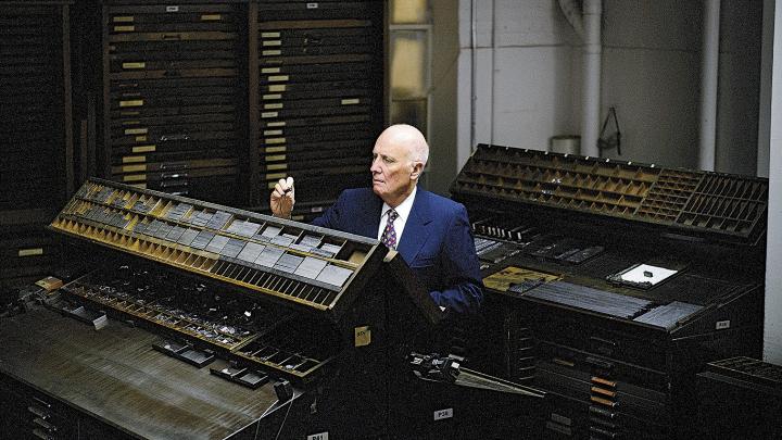
Hoyem is a tall man with a stately bearing and the shambling walk of somebody whose joints are worn from many decades spent sitting, crouching, and hunching over work requiring extreme precision and care. He likes bow ties, and suits heavy enough for the fog-drenched outer reaches of the San Francisco avenues. He’s bald, with heavy-lidded eyes and a sharp, impish smile that shines out from the depths of his reserve: it can feel, sometimes, like getting a big grin from Mount Rushmore. Yet he rarely jokes about his work. Each book on the shelf emerged from a long parturition, and each conjures memories of the challenges it posed along the way.
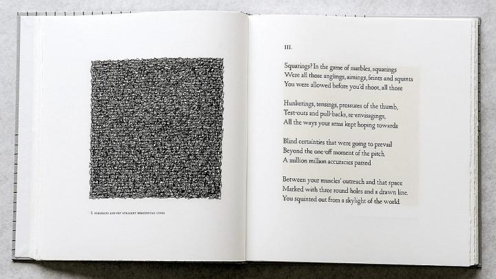
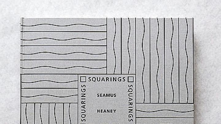
Today, Arion Press is housed in a spacious building on the edge of San Francisco’s Presidio, a lush decommissioned military base of nearly three square miles cradled by the Richmond district and Pacific Heights and swooping down toward the lower harbors of the Golden Gate. Down a long hallway on the entry level, display cases feature selected volumes, some of which grew from Hoyem’s longstanding relationship with Vendler. Stone from Delphi is their second book of Heaney’s poetry; in 2003, Vendler helped Hoyem assemble Squarings, a sequence of 48 Heaney poems, originally from his collection Seeing Things. Sol LeWitt, the chosen illustrator, answered with 48 drawings of his own—each six inches square and based on a varying grid on which LeWitt produced “scribbles” (his word). The effect on the page is one of dazzling opticality: forms that are at once rigorously geometric and diaphanously undefined. In her introduction, Vendler explores the poems as evidence of a similar dance between the speaker’s ordering intelligence and the free play of his imagination. “Imagined grids and lines,” she explains, “are the latitude and longitude lines by which mentality orders the world.”
Occasionally, Hoyem has found himself so strongly drawn to an existing work of art as the complement for poetry that commissioning new work is unnecessary. That was the case when he undertook to publish T.S. Eliot’s The Waste Land, in 2007, again with a Vendler introduction. He could imagine no more fitting work than R.B. Kitaj’s 1975-76 canvas If Not, Not: a vivid, dreamy composition that Hoyem, picking up on the idea of an in-house master printer, presented across several pages, both as a whole and in fragments. Kitaj, while alive, also contributed lithograph portraits to an edition of Allen Ginsberg’s Kaddish, White Shroud, and Black Shroud that the press published in 1992. And although Vendler is a not a scholar frequently associated with Beat poetry, she warmed to the project as well. “It seemed to me it was a new line, obviously depending on Whitman, but it had a different rhythm than Whitman’s,” she says. “A kind of beachhead of gay pride, as we would call it now.”
Vendler’s own favorite Arion collaboration has been a collection of Wallace Stevens poems that she introduced, in 1985, with original art by Jasper Johns—an artist whom Hoyem recalls as her special request for the project. (“He is the poet I feel closest to,” she explains, “and I had always wanted to see the poems treated with the dignity they deserve.”) The collection includes 122 poems selected by Vendler; the frontispiece, by Johns, was one of four works he later included in his series The Seasons.
After nearly three decades together, Hoyem and Vendler have built a catalog within the press’s greater list—Yeats with original Richard Diebenkorn illustrations, Shakespeare’s sonnets bound in goatskin and Japanese cloth. Not every collaboration has gone wholly as planned. When Hoyem and Vendler hoped to produce an edition of Emily Dickinson poems, the Harvard University Press, which still holds rights to Dickinson’s oeuvre and exercises them actively, wouldn’t let them be printed even in a small fine-press edition. So Hoyem, working alone, devised a work-around, using the public-domain early, edited versions of the poems, with art by Kiki Smith. “Harvard thinks it controls Emily Dickinson,” Hoyem explains, dryly. “I disagree.”
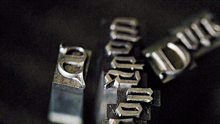
Arion Press’s workshop is located on the lower floor of its facility. At one end is the M & H type foundry: a stark, cavernous space smelling of machine oil and metal. There is a kiln, where Hoyem and his colleagues melt lead into ingots to be used for monotype; stations across the room contain casting equipment. Since the 1990s, Hoyem has been using computer interfaces to cast monotype directly from computer-generated text, expediting the scrupulous work of turning sentence after sentence into lead. Some of the press’s most rarefied projects, though, are set by hand. In deference to local printing tradition, Hoyem files his more than 100 tons of poured type largely in what are known as California job cases, with the noncapital and capital letters kept in side-by-side arrays of compartments. More traditionally, though, they’re stacked: the lower case and the upper case.
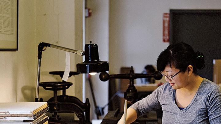
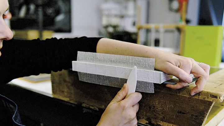
Part of Hoyem’s duty as a master craftsman lies in training. He takes apprentices, as his predecessors did for centuries. It is no mean commitment: an apprenticeship runs four years in the foundry and press room, two in the bindery—and that’s only the groundwork. “To get the quality in press work that we demand, it takes years,” he says. He enforces a schedule. Each morning, staff members are on the job at 8:30; they get a short lunch and an afternoon coffee break and leave promptly at 5. Otherwise, they’re at their stations. A visit to the bindery might find a couple of staffers hard at work making slipcases for Stone from Delphi. At one end of the room is a sewing machine that they use to sew together many books’ spines, though the most labor-intensive volumes are stitched together by hand, on frames. Hand-sewn bindings don’t break or gape or hang open to certain pages, so they’re perfect for books that get lots of scrutiny and use, like the landmark Arion Press Bible that, today, is the volume on the pulpit in San Francisco’s Grace Cathedral.
It’s a local connection that fits with many in the press’s past. San Francisco has had a tradition as a printing town, from the Gold Rush era onward, and, in the 1920s, the brothers Edwin and Robert Grabhorn helped set the cornerstone of local tradition. The Grabhorns were trained partly in the principles of “allusive typography”—the idea that typefaces ought subtly to echo the period and style of the writing being typeset. And they believed that the moist, foggy air of San Francisco helped prime paper for inking. In 1930, they published a sumptuous 400-copy edition of Walt Whitman’s Leaves of Grass, set entirely by hand; it’s printed in a large, Goudy type on generous pages (14.4 by 9.75 inches), illustrated with woodcuts, and bound in red goatskin and mahogany. Edwin Grabhorn called the edition “the most perfect book we ever printed.”
Hoyem thought so, too. He was born in South Dakota, but his family moved to Iowa during the Second World War. In 1946, they relocated to the Mojave Desert so that his father, a physicist, could take a job in weapons development. Hoyem went to college at Pomona, then enlisted in the navy. When his service ended, he was accepted for graduate school at Columbia, in political science. But he put off installing himself in New York, keen to kill some time and make a bit of money in San Francisco, which was then in the heady throes of a print renaissance. In 1961, on something of a whim, he took a job at Auerhahn Press, an early organ of Beat poetry and the literary avant-garde. (It published William S. Burroughs ’36, G ’40, and Charles Olson, among others.) “We were printing by letterpress mainly because it was a cheap way to get started,” Hoyem explains. At work arranging type, he fell in love. Auerhahn Press was located around the corner from the Grabhorns’ center of operations, and by 1964, he’d begun working there part time, in addition to his Auerhahn duties.
Joining Grabhorn Press changed Hoyem’s life. Learning at the knee of the local masters, he trained toward exacting standards. And during the late 1960s, it was Hoyem who stepped in to sustain the Grabhorns’ tradition. Partnering with Robert Grabhorn, he launched a new iteration of their celebrated endeavor. In 1973, not long before Grabhorn died, he arranged to take over all his printing machinery. Endowed with this historical equipment and some aesthetic ambitions of his own, Hoyem launched Arion Press in 1974, taking the name from the Dionysiac poet who, according to myth, was rescued by dolphins.
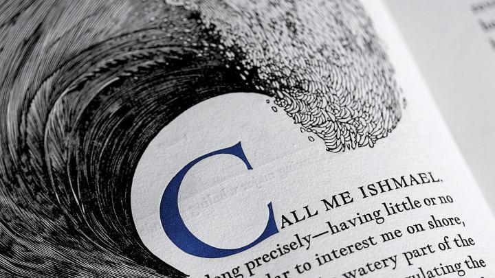
“I was aware of the French tradition of the livre d’artiste,” Hoyem explains—books produced with great craft and in small editions, usually designed around, or prominently featuring, original art. “My goal was to make artists’ books that were entirely cohesive—so that you couldn’t separate the art from the typography, visually or in concept.” In the late 1970s, he undertook to print a new edition of Herman Melville’s Moby-Dick, using the Grabhorns’ Leaves of Grass as a rough guide both in format and in ambition. The book would be large, 15 inches by 10, and hand-set, like the Whitman, in a Goudy face. Hoyem commissioned 100 wood engravings from the artist Barry Moser, but he was particular about what they could depict. No main characters—including the whale—should appear in an illustration, he advised; no major action scene should be rendered. The idea was to let readers create their own mental images of characters and scenes based on the author’s writing, with the engravings there only to help them fill in the visual details (like whaling equipment) that they weren’t able to envision on their own.
To study the Arion Press edition of Moby-Dick today is to have an almost sacred experience of the power of physical print. Its ink is black, with wide margins and initial letters in a dark, aqueous blue. The paper is a faint blue-gray, like the surface of the ocean on a cloudy day. When the reader lifts a page to turn it, the watermark of a whale shimmers through. Because the letter w is particularly wide, Hoyem made the abutting spaces slightly narrower; every semicolon has a hairsbreadth gap before it, as if signaling the partial stop. The result is something that one would not think possible: a nearly perfect book.
The audience for Arion Press’s work is small but devout, dominated by specialized collectors and subject to the rise and fall of the art market more than to the changing fortunes of the customers of Barnes & Noble. The press relies a good deal on regular subscribers, who collect the new books as they appear, and on institutions such as Harvard’s Houghton Library, which regularly orders volumes for its collection. (To augment his passion projects, Hoyem takes commissions for private printings.) The ideal buyer, he says, is someone whose interests lie at the intersection of literature, art, and printing craft—and such people come along more rarely than one might expect. “Most art collectors are not readers,” he explained. “They want big, splashy stuff on their walls to show how rich they are.” In more than one egregious case, buyers sliced the original Jasper Johns etchings out of an Arion edition and sold them as self-sufficient works. There is, always, the risk that the market will trump the art.
Half a century ago, the main contours of literary connoisseurship were clear. The canon started with the classics, swept up into Modernism, and left few major works of English-language poetry and fiction unstudied along the way. High culture was, in large degree, a body of shared knowledge; scholars tested unknown works as one might assess porcelain: tapping them at crucial points and listening for the familiar, canonic ring. “Although most of the art of the past falls away into what [Wallace] Stevens called ‘the trash can at the end of the world,’ ” Vendler wrote in her Ashbery introduction, “the great European conservatories, the libraries and the museums, keep our collective Western past in a condensed and selective form.” Erudition leaves a material trace, as does its opposite. When Fitzgerald, writing in the 1920s, had Nick Carraway stumble into a vast library stocked with “absolutely real” books whose pages hadn’t been cut, the detail was intended to convey, quite literally, volumes about Gatsby’s habits of mind.
The limited-edition art book for years benefited from this outlook. If a handful of texts were the measure of the culture’s strength, what could be more appropriate than dignifying those canonic works with material refinement? Then, in or about the 1960s, high culture changed. The idea of an absolute canon fell into question, and alternatives emerged. When serious critics today turn their attention to rock music, it is with the idea that Sgt. Pepper’s Lonely Hearts Club Band may have exercised as significant an influence on the creative imagination of its era as Mrs. Dalloway did in its own time. The challenge of the literary world today is not a dearth of quality. It is an excess of excellence, contextually defined.
The role of fine-press books, like those Arion Press publishes, has changed, too. There’s now the responsibility not only of perfection but of selection—what to publish at a time when so much may be worthy of attention. Arion Press has played both within that model and against it. The projects it produces have one foot in tradition. (After all, fine press work is virtually extinct.) But the press also embraces a more idiosyncratic approach. Hoyem takes a lot of pride in his new publication of The Moonstone, the Wilkie Collins proto-detective novel, here presented in a luxurious edition with original scratchboard drawings by Stan Washburn: an important, if not traditionally high-literary, text that’s dignified by a generous presentation. Even a reader paging through Stone from Delphi is encountering poetry that’s still relatively fresh.
Vendler, who’s built a scholarly career commuting between the old canon and new work, is in many ways a critical counterpart to this effort. As a doctoral candidate at Harvard in the 1950s, she studied with I.A. Richards, himself a University Professor and an enormously influential literary critic often cited as the modern-day father of what’s sometimes called “close reading”: a method of explication based on the idea that authorial intent and word-by-word structure are mutually illuminating. His approach was implicitly an empirical answer to the “why” of the canon: Why might readers attend to Shakespeare more than to Marlowe? Why was the slippery modernism of Eliot [A.B. 1910, A.M. ’11, LL.D. ’47] worth teasing out, line by line? And it provided a standard of appraisal beyond the normal vagaries of taste. Like her teacher, Vendler is now known not only as a guardian and expositor of the poetic classics (her dazzling, line-by-line study of all of Shakespeare’s sonnets is today considered the definitive guide through the Bard’s poetry) but as a prescient arbiter of contemporary esteem.
Vendler first encountered Seamus Heaney’s work during a visit to Sligo, Ireland, in 1975, and quickly became his most eloquent American critical champion. Heaney came to Harvard as the Boylston professor of rhetoric and oratory; he was succeeded, in 1998, by Jorie Graham, another rising poet whose poems Vendler helped introduce to readers. That critical relationship remains strong: as it happens, a volume of Graham’s poems is the next project on which she and the press will collaborate.
These days, Vendler lives the fast but quiet life of a late-career literary lioness. Her critical opinions are among the most celebrated and distinctive in the nation; her schedule, even in these senior years of her career, runs tight; and she’s accustomed, on the dais or in magazines, to reach audiences of thousands. Why set aside the time and energy to contribute tens of thousands of words, across decades, to books whose press runs seldom exceed 400 copies, and whose audience mainly comprises a small circle of collectors? “It makes me think,” she explained, not too long ago, in the cozy book-lined office that she keeps in Harvard’s Barker Center. “It was strange to be doing these anthologies of so many different poems. Taking on the problem of how to present Stevens to people, or how to present Yeats.
“George Herbert says, in ‘The Forerunners,’ [that he brought his] thoughts ‘to church well dressed and clad: / My God must have my best, ev’n all I had.’ I think bringing poems, well-dressed and clad, is a tribute to the poems,” she went on. “I hope people wouldn’t see this as fetishizing—as they say so horribly—the text, but it’s paying the text the honor it deserves.”
Others have agreed. Since their early days as publishers, Hoyem and Ketcham have been surrounded, both professionally and socially, by a cohort of creative minds. (In the early 1980s, Ketcham and Wendy Lesser ’73, the founding editor of The Threepenny Review, organized an informal group of local writers that met for lunch at Oakland’s BayWolf restaurant; regular participants included the then-local poets Robert Pinsky and Robert Hass.) Although Ketcham wryly describes Hoyem and herself as “provincials from California,” they take pride in the milieu they have assembled—and that milieu, in turn, enjoys the particular creative opportunities that they provide. At one point, Hoyem, designing an edition of The Great Gatsby, wrote to the architect Michael Graves, M.Arch. ’59, to ask him about contributing art; he’d heard that Graves reread the book every year. Hoyem had been misinformed—it was actually the architect Robert A.M. Stern’s favorite book—but Graves was delighted with the assignment all the same, and, somewhere in the midst of completing his design for the Whitney Museum addition (a project eventually abandoned), he submitted elaborate, intricate designs for everything from wine glasses to garden landscaping for Gatsby’s imagined West Egg estate. Late this past spring, Hoyem and Ketcham flew to New York for a celebration of one of their recent projects, Thomas Jefferson’s Paris Walks—written by Ketcham with photographs by Michael Kenna—at Hermès on Madison Avenue, where the book was on display.
The broad social orbit is as much about keeping an eye out for new talent as it is about sharing their wares. Hoyem is 77. He is beginning to think about retirement and about the future of the press. Lately, he’s been casting his gaze around for successors, people who share his exacting knowledge of fine press work and his big ambitions for the smallest arm of publishing.
“It could possibly be someone from the art world, but I haven’t met a lot of people who have a strong literary bent,” he says. The trouble is, partly, the point: no one is inventing books quite like those Arion Press makes. Hoyem isn’t too concerned, though, and there’s reason to think everything will work out. So far, he has never had much trouble finding the right people for the task.
Updated 8.19.13 to reflect three clarifications from Arion Press. Not all type is melted down once a press run is complete: handset type is returned to its cases, unlike monotype, which is melted down. The pages of the volume Self-Portrait in a Convex Mirror were not trimmed to their dimensions, but handmade as round sheets. Hoyem’s father worked on an atom-smashing machine at the University of Iowa; he worked on weapons development after relocating to the Mojave Desert. In addition, Helen Vendler has informed us that the paraphrase from “The Forerunners,” by George Herbert, should have referred to "thoughts" brought to church, not “poems” (which appears in the print edition). We regret the error.
