


Corita Kent was a Catholic nun who went straight from high school into a convent in 1936, and then, improbably, became a Pop artist in the 1960s. She taught art at Immaculate Heart College, which was run by her order, the Immaculate Heart of Mary in Los Angeles, often taking her students to local galleries and museums. “In 1962,” says art historian Susan Dackerman, “at the nearby Ferus Gallery, a then practically unknown artist named Andy Warhol showed his soup-can paintings for the first time, and Kent saw them.”
Warhol’s work, Kent said later, changed the way she saw everything. In 1964, she created a screenprint in response to Warhol’s soup cans titled, after a Del Monte Foods slogan, the juiciest tomato of all. This print, graphically powerful even from a distance, includes in a cursive hand too small to read from afar the provocative phrase, “Mary mother is the juiciest tomato of all.” The work kicked off a decade of Pop art-making, Dackerman adds. The former Weyerhaeuser curator of prints at the Harvard Art Museums has now, as a consulting curator, arranged an exhibition—Corita Kent and the Language of Pop—that will open September 3 at the museums.
After Kent’s death in 1986, her papers went to the Schlesinger Library at Radcliffe, and in 2005 the art museums bought a group of 70 of Kent’s prints, aiming to make Harvard the site for scholarly investigation of her work and its place in the Pop art movement. Interest in her work has grown recently: a retrospective organized by the Tang Museum at Skidmore is traveling now, and “edgy New York and L.A. artists such as Julie Ault and Aaron Rose have revived it in many ways,” Dackerman explains.
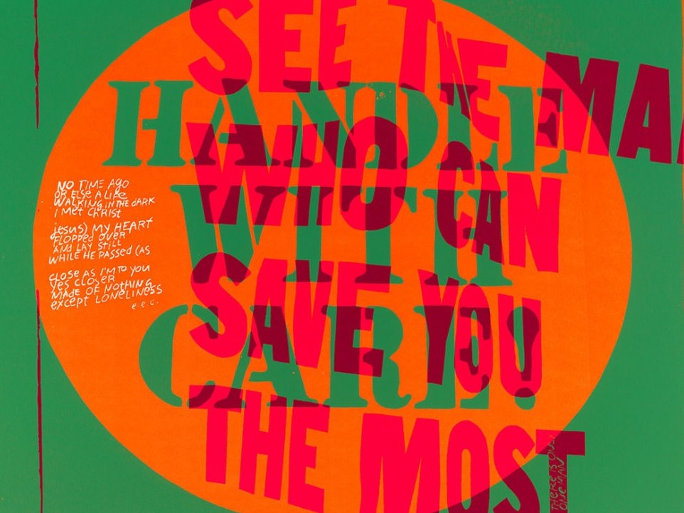
In her 1967 work handle with care (above; click arrow at right to see gallery for detail), Kent layered slogans—including words from a button and from a Chevrolet ad (“See the man who can save you the most”)—so that reading them “becomes an act of mental and physical calisthenics, that calls for slow rigorous scrutiny,” says curator Susan Dackerman. Kent also began experimenting with fluorescent inks, likely inspired by the color experimentation and theories of fellow artist Josef Albers ; his screenprint of layered squares, Wide Light; Tenuous; Full (1962) also appears in the gallery.
Harvard Art Museums/Fogg Museum, Margaret Fisher Fund, 2012.186. Courtesy of the Harvard Art Museums/ © President and Fellows of Harvard College
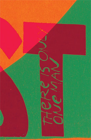
In this detail from handle with care, Kent has written "There is only one man" in the ascender of the letter T.
Harvard Art Museums/Fogg Museum, Margaret Fisher Fund, 2012.186. Courtesy of the Harvard Art Museums/ © President and Fellows of Harvard College
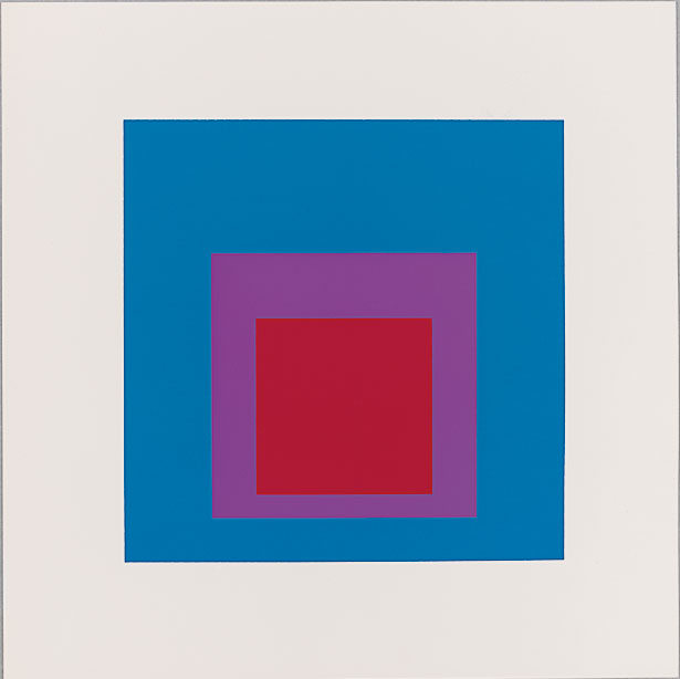
Josef Albers's screenprint of layered squares, Wide Light; Tenuous; Full (1962)
Harvard Art Museums/Fogg Museum, Gift of Warren Robert Stone, M15382; The Josef and Anni Albers Foundation/Artists Rights Society (ARS), New York/courtesy of the Harvard Art Museums/ © President and Fellows of Harvard College
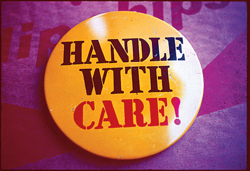
Kent took the title and theme of handle with care from a slogan reproduced on a button.
Corita Art Center, Immaculate Heart Community, Los Angeles/courtesy of the Harvard Art Museums/ © President and Fellows of Harvard College
She and Agassiz professor of the humanities Jennifer Roberts, together with a group of graduate students, have spent the past four years researching Kent’s work in preparation for the show, and writing detailed entries for the accompanying catalog. The Harvard exhibition, which includes prints by Warhol, Ed Ruscha, Roy Lichtenstein, Frank Stella, and Josef Albers, among many others, focuses on the period of Kent’s strongest work, from 1964 to 1969—putting it in “a broader cultural and art historical context,” says Dackerman, “to show where it comes from [and]…the motivations behind it.”
What did Kent intend in the juiciest tomato of all? At the same time that Warhol began showing his soup-can paintings, in 1962, the Second Vatican Council began a project to modernize Catholic liturgy all over the world. Among the changes introduced by Vatican II was a shift from Latin to local, native languages when saying Mass; in the United States, priests turned around, faced the congregation for the first time, and spoke in English. The idea, explains Dackerman, was to “take away the intimidating, formal qualities of Catholicism and make it friendlier,” and this turn to a vernacular language in the church, she points out, exactly paralleled what the Pop artists were doing: appropriating the slogans, jingles, logos, and images of consumer culture for their own use. Kent, having seen Warhol’s work and eager to enable the goals of Vatican II, “crosses these wires.”
In handle with care, for example, she transforms a slogan from a Chevrolet ad—“See the man who can save you the most”—to deliver a distinctly spiritual message. Just as in the juiciest tomato of all, she uses small, handwritten text as a key to unlock the meaning of the words rendered in large type: embedded in the upright of the terminal letter “t,” she has scrawled, “There is only one man.”
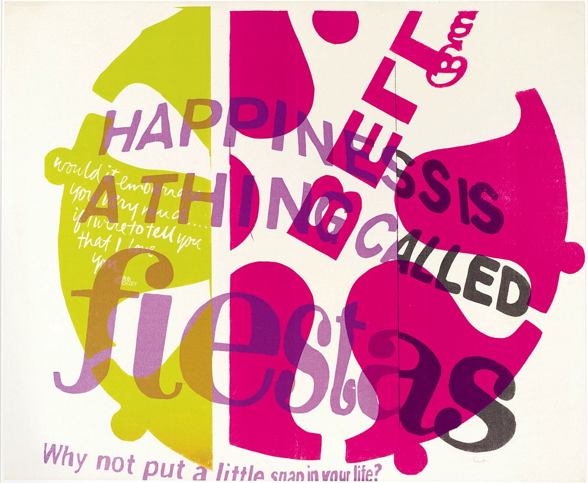
In her 1967 print bell brand, Kent adopts the vivid packaging color combinations and catchy jingles ("Happiness is a thing called fiestas"; and "Why not put a little snap in your life?") of a supermarket product to "modernize and make accessible the language, imagery, and practices of the church," writes doctoral student Eva Payne in the catalog. Kent took the text in the leftmost bell—“would it embarrass you very much…if I were to tell you that I love you”—from The Nazz, a 1950s performance piece retelling the life of Jesus.
Harvard Art Museums/Fogg Museum, Margaret Fisher Fund, 2008.165. ©Corita Art Center, Immaculate Heart Community, Los Angeles/courtesy of the Harvard Art Museums/ © President and Fellows of Harvard College

The logo of Bell Brands snack foods.
Courtesy of the Harvard Art Museums/ © President and Fellows of Harvard College
Over time, Kent developed a rich Pop art iconography for the depiction of Catholic subjects. In bell brand, the colors, words, and logo (a ring of bells, from the packaging of a Southern California brand of potato chips) became the inspiration for a print intended to evoke the Eucharist. “In the most important moment in the Catholic Mass, the moment of transubstantiation when the bread and wine are turned into the body and blood of Christ,” explains Dackerman, “the priest rings a bell. In some places, he rings a ring of bells.” Kent’s print thus likens communion wafers to potato chips, suggesting that “the divine can be present anywhere”: even in a potato chip.
Sparks flew. Although Kent’s aspirations for her work aligned with the liberalizing aims of Vatican II, “the ambitions of Vatican II didn’t really come to pass in the 1960s,” says Dackerman. In Los Angeles, “the archdiocese was outraged.” Kent and the convent came under pressure. In 1968, exhausted by the criticism, and perhaps dispirited that the goals of Vatican II hadn’t come to pass, Kent moved to Boston, where she had friends and connections to a gallery that exhibited her work. There, in 1971, she gave her new city its most famous Pop art landmark, familiar to any Boston native: the rainbow mural on an enormous natural-gas holding tank visible from the city’s Southeast Expressway, painted in swaths of primary and secondary colors.
The gas tank painting represents “the culmination of a decade of work on Pop art,” Dackerman explains. In the 1960s, she continues, Pop art turned not only to commodity culture, but also to the products and processes of art-making itself: Roy Lichtenstein starts making a series of brush strokes, Jim Dine draws paint brushes and experiments with pure color, and “Corita is very much aware of that.” Kent had also witnessed first-hand the transformative power of art. Ed Ruscha’s famous depiction of the Hollywood sign took a dilapidated icon erected by a Los Angeles real-estate company in 1923 and rehabilitated it. Although the letters were falling off the actual sign, Ruscha depicted it as if it were brand new, and moved it from the side of the hill to the top of the ridge. “Once Ruscha has made the Hollywood sign an icon of Pop art,” says Dackerman, “the sign is rehabilitated and itself becomes a Pop art monument, a landmark in Los Angeles.” Kent, living in the convent below the Hollywood sign, saw how Ruscha reimagined it, and in 1970, when asked by Boston Gas Company to decorate its gas tank, Dackerman argues, “she sees this as an opportunity to transform it into a Pop art landmark for her new city.”
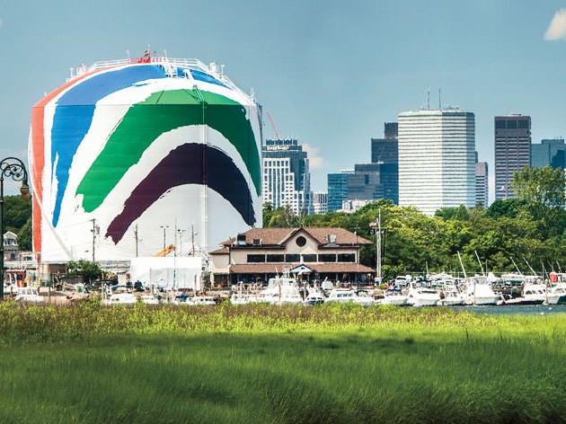
Kent lived in the shadow of the decaying 1923 Hollywood sign, and saw how Pop artist Ed Ruscha had reimagined the decaying eyesore in his 1968 screenprint, Hollywood. In 1971, Kent's Boston Gas Tank (Rainbow Tank) transformed a colossal industrial form into a much-loved landmark. Using the Pop art palette of primary and secondary colors, Kent painted bright stripes onto a seven-inch-high model provided by Boston Gas; sign-painters then transferred the design onto the tank. When the tank was replaced in the 1990s, a public outcry led to restoration of the mural.
Photograph by Jim Harrison
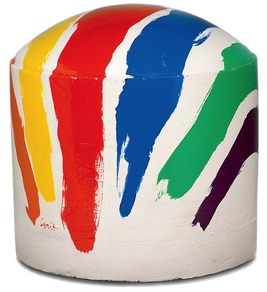
Kent painted bright stripes onto a seven-inch-high model provided by Boston Gas
Collection of National Grid, Dorchester, Massachusetts; National Grid/courtesy of the Harvard Art Museums/ © President and Fellows of Harvard College
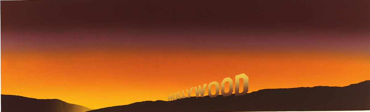
Pop artist Ed Ruscha reimagined the now-landmark sign in his 1968 screenprint, Hollywood
Harvard Art Museums/Fogg Museum, Transfer from the Student Print Rental Collection, M20232; Edward J. Ruscha IV/Gagosian Gallery/courtesy of the Harvard Art Museums/ © President and Fellows of Harvard College
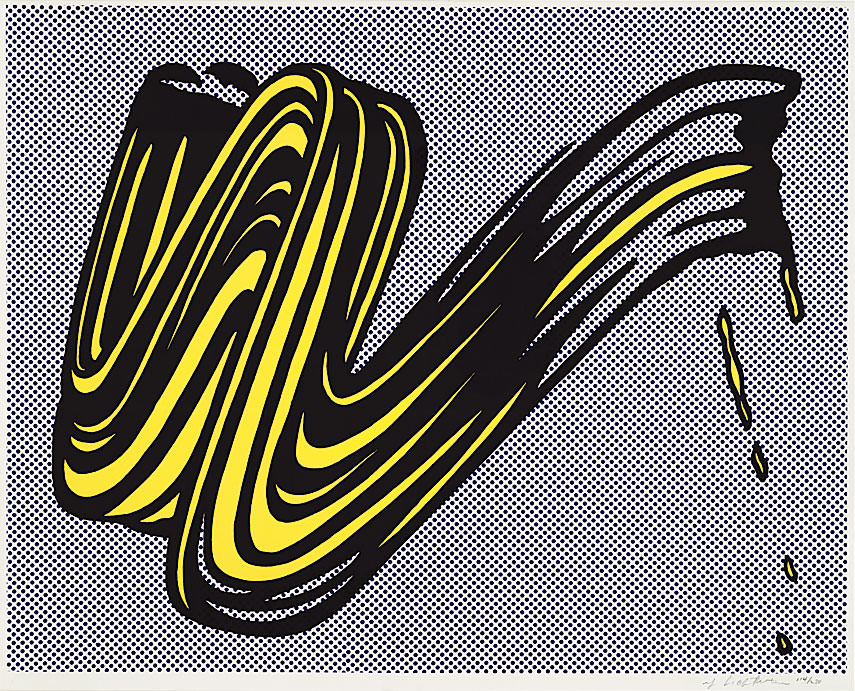
Roy Lichtenstein’s satirical 1965 work Brushstroke likely inspired Kent’s overt homage to the mechanics of art-making.
Harvard Art Museums/Fogg Museum, Bequest of William S. Lieberman, 2007.56; Estate of Roy Lichtenstein/courtesy of the Harvard Art Museums/ © President and Fellows of Harvard College
Clearly, Kent’s art was in profound dialogue with that of other Pop artists in the 1960s, the curator declares—but Kent herself had no personal connections with any of her peers. Warhol sometimes went to her openings, and Ruscha, whose studio was nearby, told his students to go to print sales at the convent, but “Corita Kent in her habit couldn’t very well go hang out at The Factory with Warhol. There wasn’t really room in Pop art’s macho style for women artists.” The announcements for the artists who exhibited at the Ferus Gallery (they were known as “the Ferus studs”) “show them shirtless on surfboards or sitting on motorcycles,” Dackerman explains. “You can’t put a nun in that picture and convey the same message.” But with Corita Kent and the Language of Pop, the artist’s prints finally find their place in Pop art’s pantheon. The former nun hangs with Warhol.


