Main Menu · Search ·Current Issue ·Contact ·Archives ·Centennial ·Letters to the Editor ·FAQs
|
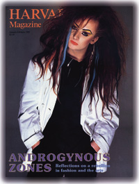
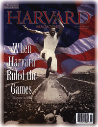
A linotype slug sat on the desk of the managing editor of this magazine 30 years ago. It was a flat strip of metal three and a half inches long with raised letters on one edge. The letters spelled--backwards--the words: "Changing even a comma means resetting this entire line at a cost of $1.50." The message was a caution to editors to knock off their incessant fiddling. The slug itself bespoke technology to which they were about to say good-bye. Type for the magazine had been set on a Linotype machine ever since 1898, when volume one, number one, passed through the press at the Crimson Printing Company. (The first issue emerged at 8:45 p.m.) Otto Mergenthaler had invented the workhorse machine in 1884, and Thomas Edison is said to have called it "the eighth wonder of the world." A compositor sitting at the 90-key keyboard of a Linotype could do four or five times faster what others did when setting type by hand one character at a time, the way Johann Gutenberg had taught them. Any little boy would love a Linotype machine. Seven feet tall, six feet wide and deep, it had a magazine at its top full of little brass molds, with letters, numbers, and other characters imprinted in them. The compositor tapped the "H" key, and a mold for a capital "H" came down into the guts of the machine; then he tapped "a," and down came a mold for a lowercase "a" and aligned itself next to the "H." And so on. The machine had a bucket of hot metal-- lead, tin, and antimony, at 550 degrees-- around back, which gave the area surrounding a Linotype a good industrial smell. When the compositor had set a line of molds, he caused the bucket to discharge molten metal into them, which quickly cooled, and out of the side of the machine came a slug, a line o' type. Then the molds went by elevator back to the top of the machine and into the magazine, while others descended, with a sound like scurrying mice. The compositor and his colleagues assembled a column of slugs, tied them tightly with string, inked them with a roller, and pressed them into paper (thus "letterpress" printing), pulling a galley proof, which they sent by delivery boy to the customer--us. If an editor wished to add or subtract a comma, the compositor and his colleagues had to untie the string, load the molds for the proper typeface into the Linotype, make a new slug, insert it in the proper place in the column of type, retie the string, get out the ink roller, and pull a new proof to show themselves and us that they had done these things without error. In the normal way, all this cost not only $1.50, but several days. If a big word instead of a comma was at issue, all the lines in the rest of the paragraph needed to be reset. If a comma had to be changed after the printer made a page proof--that is, after he had joined together illustrations (each its own metal plate on its own block of wood) and columns of type--the consequences of putting asunder were graver. If the feckless editor changed a comma just as the job seemed ready to print, when the printer had locked up pages in steel frames known as chases with mechanical wedges called quoins and fastened them onto the bed of his press, buttressing them with blocks of wood to make all square and pounding with mallets to make all level, the matter was grave indeed. Letterpress printing from hot-metal type made jazzy layouts hard to do, and the editors yearned to do jazzy layouts --you know, type superimposed on pictures, words actually coming out of a person's mouth, that sort of thing. In 1968 they bid farewell to the Linotype and to letterpress and their old friends at Crimson Printing. They had been seduced by phototype, offset lithography, and the Rapid Service Press. A flash of light passes through a capital "H" on a film stencil, then through a lens that makes the letter the wanted height, then falls upon a piece of photosensitive paper. The paper, processed, is phototype, or cold type. Rapid Service Press's phototypesetting machine was new technology and broke down regularly. Until recently, the editors of this magazine were also its graphic designers (hiring consultants for the occasional major redesign). They cut up duplicate galley proofs of phototype with long scissors, applied adhesive hot wax to the backs of the galleys, and stuck them down on grid sheets to form a rough dummy showing how they wished pages to look. They sent the dummy to the printer, who pasted up the original phototype in precise imitation of the dummy pages. This clean and tidy placement of type is made on a light table with an X-Acto knife, hot wax, and a T-square, and is called a mechanical. A cameraman with a very large camera photographed the mechanical for each page. He also photographed the photographs that would go with the type, breaking them up into dots of different sizes, which is how you print a photograph of many shades of gray with black ink only. He photographed the advertisements. The printer then had a lot of bits and pieces of film. A stripper combined the bits and pieces, stripping together with red tape the film for a photograph, for instance, with the type around it. A platemaker put the combined film in a vacuum box against a photosensitive plate and burned the image of the type and pictures onto the plate with light. An offset lithography plate looks flat and feels smooth to the touch. It works because of the antipathy between oil and water. The chemistry of the plate's surface is such that when a water roller passes over it, water adheres to the blank parts of the plate. Ink, which is oily, is repelled by the water but adheres to the image on the plate. A rubber blanket passes over the oiled and watered plate, picks up the ink from it, and o!=sets the ink onto paper. Despite many other changes in technology, the magazine is still printed by offset, on city-block-long presses that print 32 pages at a time at the rate of 58,000 impressions per hour in a Perry®Judd's Inc. plant in the beautiful Shenandoah Valley of Virginia. Today, almost all the work that used to be done by compositors, mechanical-makers, cameramen, and strippers is done by civilians at Harvard Magazine, in its yellow Victorian house on Ware Street. The editors have wrested control over these operations from the printer and now have only themselves to scold when things go wrong. The wresting process began gently, innocently. For a time after the move to Rapid Service Press, the editors let the printer make the mechanicals--those precise paste-ups ready for the camera--but then they perceived that if they hired a freelance mechanical-maker to come to the office for two or three weeks each issue, and provided a light table, a T-square, and plenty of knife blades, they would save money and save time (and thus have more of it in which to be compulsive). The editors employed a succession of freelance mechanical-makers. They happened all to be women--ladies of the knife. At the beginning of 1991, the last of the ladies was cutting and pasting computer-generated type produced by a Cambridge firm called DNH. (The proprietor's name was David Flanagan. He was often out of the office, and the company's name was an abbreviation of what the receptionist frequently had to say: "Dave's not here.") On a May day in that year, the editors' lives changed most profoundly. Four of them--three old dogs and one young one-- reported for three to five days of training in desktop publishing. Macintosh computers had appeared in the office, and the young dog had persuaded the old ones that they could learn how to use them to set type and lay out pages with software called QuarkXPress. The editors straightaway did so. They learned to make digitized versions of black-and-white photographs on a scanner in the office so that in their computers they could combine (in effect, strip) those pictures and type. They got into full-color work in 1993, when the Harvard Alumni Association placed a travel advertisement that had 27 small color photographs of faraway places. To buy from an outside supplier color scans of 27 pictures and pay the printer to strip them into position--which is how we dealt with the color pictures at that time --would have cost $4,000. The young-dog editor proposed that we try out a system about to be introduced by Kodak that would let ordinary folks take the color slides they made on their vacations down to the local photo store to be scanned onto a photographic compact disc, which could be viewed on a television screen at home. We could manipulate those scans on our computer to make sure the colors were correct. And we could combine the scans with the type in the ad, instead of paying the printer to strip them in. We did it. Total cost for those 27 photographs? $259. The young dog was a pioneer in the use of Photo CD technology by magazines and pretty soon was giving out-of-town seminars teaching others how to do it. (Although these scans work well in most cases, the magazine still buys high-priced scans from outside suppliers for pictures it wants to run large.) The desktop revolution brought many good things to editors and readers. Deadlines could be later, and the magazine more timely. Seventy color pictures could enliven an issue instead of just 15, all that the exchequer would previously allow. Errors and infelicities became fewer; editors could mess around with commas at no cost whatsoever. But the revolution had its downside, too. Editors found themselves spending huge hunks of their time in the production business. They knew they were intended to edit, perhaps to write a bit, and to have long lunches at somebody else's expense with interesting people. Instead, they were fused to their computers, positioning picture credits exactly two points away from the lower righthand corners of pictures. In 1995 the magazine hired an art director. Such people have professional training in how to do stylish graphic design, and they emerge at birth with computers attached. The new art director soon took responsibility for the appearance of the magazine and did much of its actual assembly on her computer, quickly. The magazine looked better at once, and the editors, at last, could have a decent lunch. We got access to the internet in early 1995. Now, when we've finished making up pages of the magazine, with a tap on a computer key we connect to a computer at the printer's place in the Shenandoah Valley. With another few taps, off goes the issue into the ether. Depending on how busy the network is, we can transmit an entire issue, more than a gigabyte of data, in one and a half to three hours. Transmission time surely will lessen in future. The printer RIP's the magazine, which is to say he processes the computer files we send through a Raster Image Processor, arranging pages in eight-page units, as they will go through the press. The printer sends us a proof of the result of his RIPing, a proof in both paper and electronic versions. Changing even a comma means re-RIPing an entire eight-page unit at a cost of $360. The printer uses his RIPed computer files to make plates, which still operate on the oil-and-water principle. The phase of magazine production that involved many pieces of film has been done away with entirely for us. This has enhanced print quality, because going through the intermediate film stage was slightly corrupting. Perhaps one day printers will devise a way to get along without plates, and print directly from computer output. On April 20, 1996, the first electronic edition of Harvard Magazine went up on our website, "https://www.harvardmagazine.com". So far we have had 80,000 visitors from 110 countries. Perhaps in another 100 years--or 30--a copy of Harvard Magazine printed on paper will seem quaint. With this remark, we bequeath to our colleague, the editor-chronicler of a hundred years hence, some raw material for her opening paragraph. |
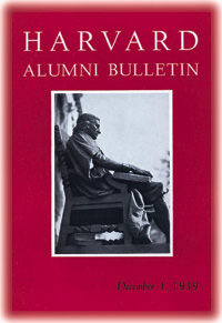
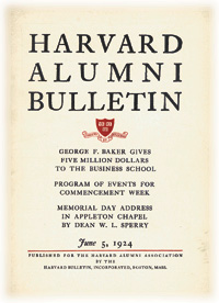 W. A. Dwiggins, another celebrated graphic designer, produced this two-color cover on cream stock in 1924 (top). It survived for 16 years, unequaled longevity. In 1939 a Bulletin writer, presumably editor John D. Merrill, A.B. 1889, recalled that the design had emerged "after much debate and talk--and even fear....Yet it was a good cover, and appeared to some of us even mildly revolutionary...."